I recently stumbled on Jack Frigaard’s Bézier Clock web page, which demonstrates his use of Processing.js to show an animated “digital” clock. He links to another page containing his Javascript code.
[Update: Jack’s original web pages are MIA, but can be found via the Internet Archive Wayback Machine here and here.]
I thought it would be fun to see if I could translate this into an iOS app; this project is the result of that effort. In truth, this is more of a transliteration than a proper translation…I converted it to Objective-C by creating equivalents to Jack’s classes, adding some UIViewControllers and UIViews, and pasting his code in. My goal was to try to simultaneously keep his code and algorithms as intact as possible, while writing fairly “proper” Objective-C. So, the resulting code is probably not quite what one would do if one started from scratch on iOS.
One other goal of this little excursion was to attempt to do this entirely with Storyboards. Typically, I’ve tried to use Interface Builder as much as possible, plus some amount of programmatic UI code. Xcode really pushes Storyboards now, but when I’ve made little toys/experiments with the Single View template, I’ve not really been using Storyboards — I just stick some UI into the built-in UIView. There’s very little UI in this app — just a handful of “dialogs”, but these employ Storyboard Segues for their invocation.
The last goal was to try to avoid anything device-specific. On an iPad, some of the UI would have been nice to show in a popover, but of course these aren’t available on iPhones due to Apple policy (you can’t use the SDK, but rumor has it that there are open source iPhone-compatible popovers available). For the simple UI in this app, the approach I took is functional, if a bit pedestrian in terms of aesthetics.
Credit is also due to Carlos Vidal, for his NKOColorPickerView. It’s very simple, clean, and easy to integrate into a project. I made some minor modifications: on an iPad, the UIViewController presentation causes the visible UIView to be dimmed, and so interactively changing the background color while manipulating the controls isn’t terribly helpful; instead, the update is deferred until the color picker is exited. Other than that, it dropped into my project in just a few minutes. Thanks, Carlos!
[Update: as of iOS 13, the dimming no longer occurs on iPad, so live update is enabled.]
The code for this iOS project is available on github (now updated for iOS 10). Check it out — I even went to the trouble of crafting some spiffy toolbar and app icons (which mostly serve to demonstrate that I should “keep my day job” as a programmer instead of trying to be a designer/artist).
Other implementations:
- A Swift implementation by Eugene Gubin.
- A Qt Quick/QML port for KDE Plasma 5 Live Wallpaper.
- An Android port by Ryan Cheng.
- An Android Live Wallpaper by Oleg Godovykh.
- A ClojureScript implementation by Richard Hull.
- The official Android Bézier Watch implementation.
- And a bonus link to something similar: Jamie Zawinski’s Dali Clock.
The Devil’s In The Details
This app is really quite simple: a single main view, plus three views for setting various options for drawing the digits, setting colors, and controlling the digits’ animation. But as I said, in the past I’d generally constructed the views in Interface Builder, programmatically created navigation views and view controllers, and programmatically controlled navigation (pushing/popping view controllers, instantiating popovers, etc.) So, in my attempt to do this entirely with Storyboards, I had to get up to speed on some of the basics, which (other than in retrospect) were not entirely obvious.
Adding a UINavigationController To A Single View Storyboard
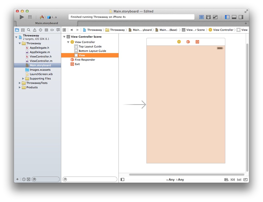
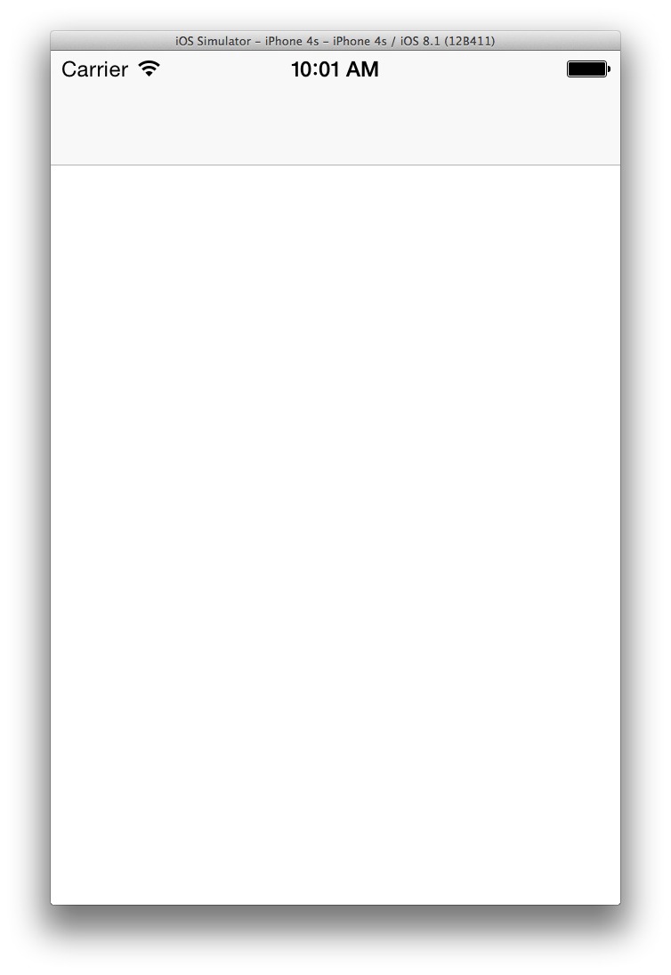
In Xcode 6, the basic Single View template uses Storyboards, but trivially – there’s basically an initial segue that takes you from the launch screen to the single view, and all you get is an unadorned UIView and UIViewController:
When run, this yields a fairly uninteresting app:

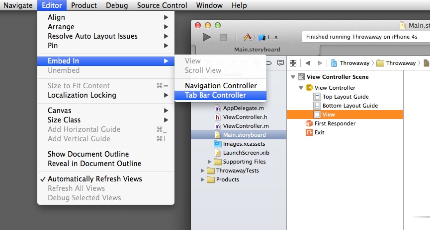
If you’re creating a project that doesn’t conform to one of the other built-in templates (master-detail, page-based, or tabbed), the Single View template is your starting point. So unless that single view is the only thing you’re going to need, the first thing you might want to do is insert a UINavigationController. This is easily accomplished, and probably not news to non-novice iOS programmers, but here’s the trick: open the Main.storyboard, select the View Controller in the View Controller Scene, and click menu item “Editor->Embed In->Navigation Controller”:
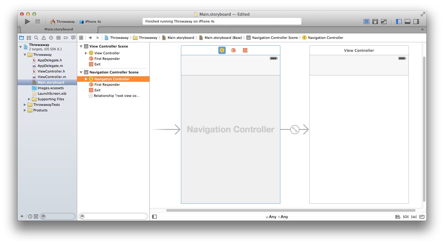
This will simply insert a UINavigationController “upstream” of the selected UIViewController, leaving the latter intact; so, this step can be done even if you’ve already started coding in the initial view. The result will look like this:
When run, you get this (note the addition of an as-yet-empty nav bar):
Adding a New UIViewController and UIView
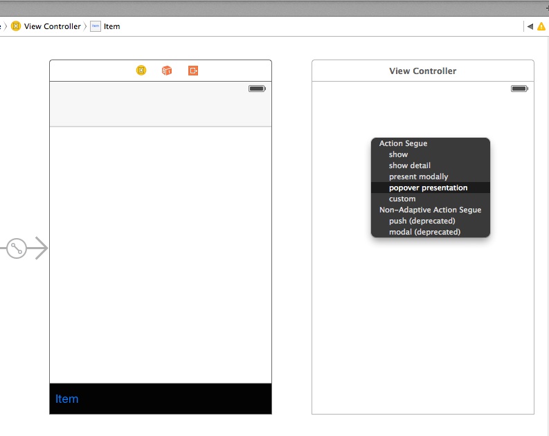
With this navigation controller in place, we now can do such things as add a view that gets displayed when the user taps a toolbar item. In my case, for the iPad I would have preferred to simply use popovers. Assuming you’ve added a toolbar item, the procedure is simple: drag-n-drop a new View Controller into the storyboard, and control-drag from the toolbar item to the new view controller:
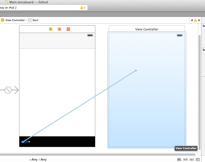
A popup menu will appear, and you can select “popover presentation”:
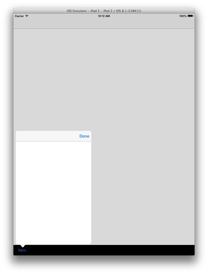
Running this on an iPad or iPad simulator will get you a nice popover when the toolbar item is tapped:
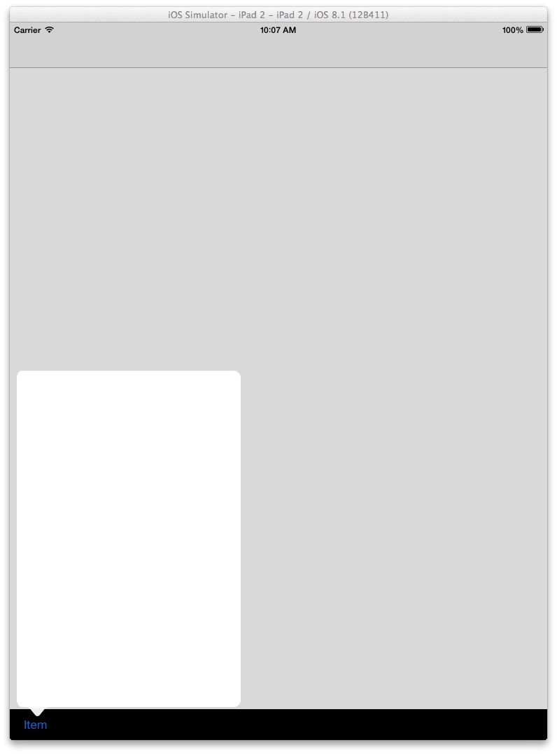
This, however, is a very limited solution: it only works for popovers, which are only available for the iPad:
Popover controllers are for use exclusively on iPad devices.
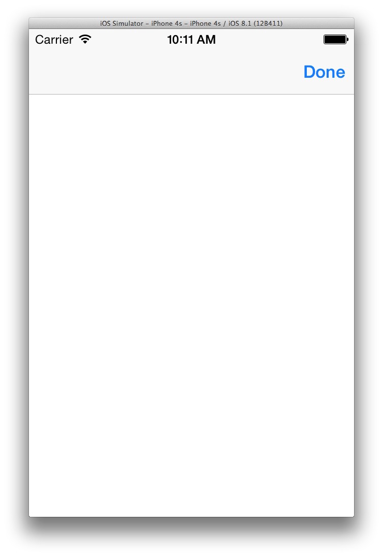
Showing the popover on an iPhone (it will appear as a Form Sheet), or selecting another presentation type instead of a popover, will show the intended view, but there will be no affordance to retire that view. The correct reaction to this issue would be “of course there isn’t, because you need a navigation controller”. The solution to this is to simply embed the new view controller in a UINavigationController, as we did with the initial single view:
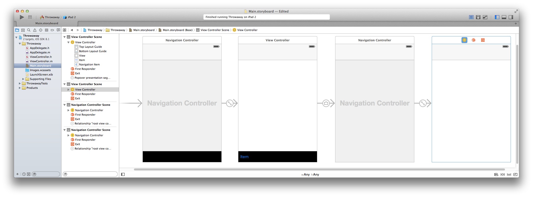
Note that at this point, we can add a “Done” button to the navigation bar, and we’d need to hook it up to an action that dismisses it, in its view controller. Assuming we’ve made this addition, we’ll now get a popover on an iPad, and a standard transition on an iPhone:
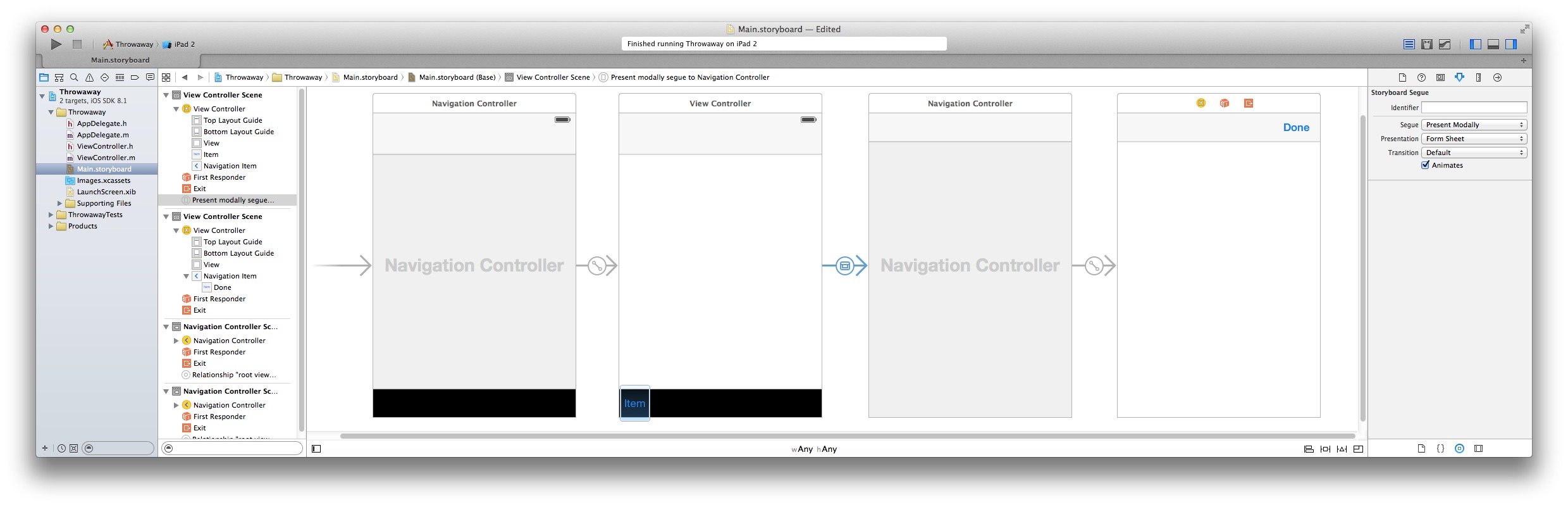
Note that on an iPad, we have a UI faux pas: the popover has that “Done” button on it, which is not only unnecessary, but is frowned upon by the Apple iOS HIG:
Avoid providing a “dismiss popover” button. A popover should close automatically when its presence is no longer necessary.
If we assume we want to continue using a popover for iPads, we either have to leave the offending Done button in, remove/hide it programmatically, somehow contrive to “do something different” in Interface Builder for the two platform types, create separate storyboards, or some other solution I haven’t already found.
To eliminate that pesky Done button for the iPad, simply add this code to the view controller’s viewWillAppear selector:
if ([[UIDevice currentDevice] userInterfaceIdiom] == UIUserInterfaceIdiomPad)
    self.navigationItem.rightBarButtonItem = nil;
By the way, there’s a useful stackoverflow thread that discusses view controller dismissal issues and options in Storyboard-based iOS apps.
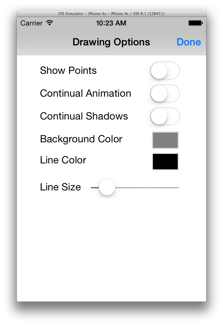
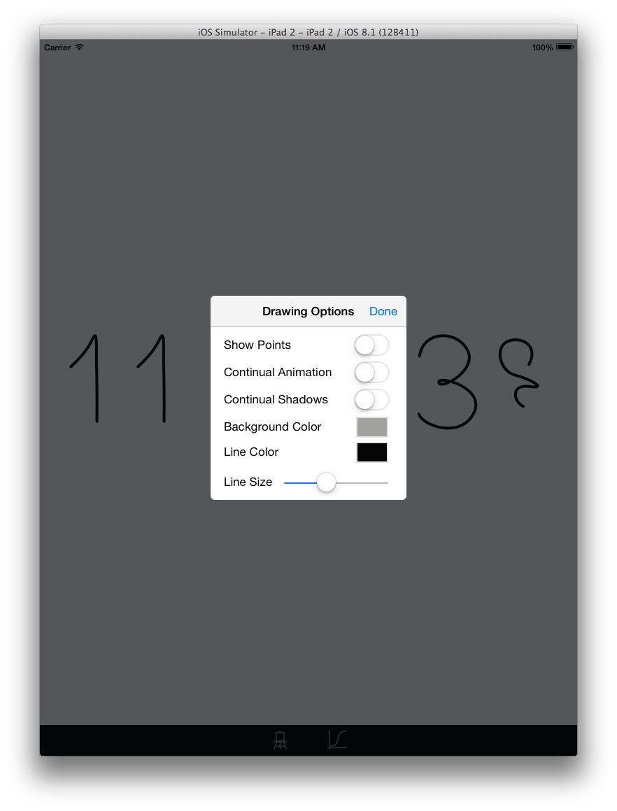
I wished to stick to my guns on my “no platform-specific anything” in this project, so I abandoned the notion of using popovers for the iPad, and instead went with using a Form Sheet for both. To do this, select the segue, change its type to “Present Modally”, and select “Form Sheet” for the Presentation type.
The downside of this approach is that we are now going to be using the same view for device types with very different sizes. In general, this can be highly problematic and undesirable: you have to limit the dimensions of the view to fit in iPhones, which at best means you’re not taking full advantage of the iPad’s size, and at worst limits what you can actually present in a reasonable fashion on an iPhone. As well, you have to deal with the basic issue of layout and constraints: a Form Sheet on an iPhone takes over the display, while the preferred style for Form Sheets on an iPad is to make them only as large as they need to be.
Shared Form Sheet View Layout for iPads and iPhones
Luckily for this app, the additional views could be made to fit on an iPhone. I was able to use a combination of Automatic Layout and Constraints to get a pleasing presentation on both device types. I was able to get an initial design that would fit on any of the iPhones, in any orientation (overly tall views in Landscape orientation could probably have been handled with a scrolling view, but this turned out not to be necessary for this app).
The particular design I came up with (unimaginative though it be) essentially meant I wanted it to fit in a rectangle of a specific size. Trying to get this effect by applying constraints to the individual UI elements is at best problematic and at worst impossible. The “trick” here was to simply insert an additional UIView inside the view in question, set its size appropriately, and insert the various UI elements into that new view. I then constrained the top edge of the inner view to its parent, and centered it inside the parent horizontally (note that I’ve temporarily set the background color in the following image to better show that inner view):
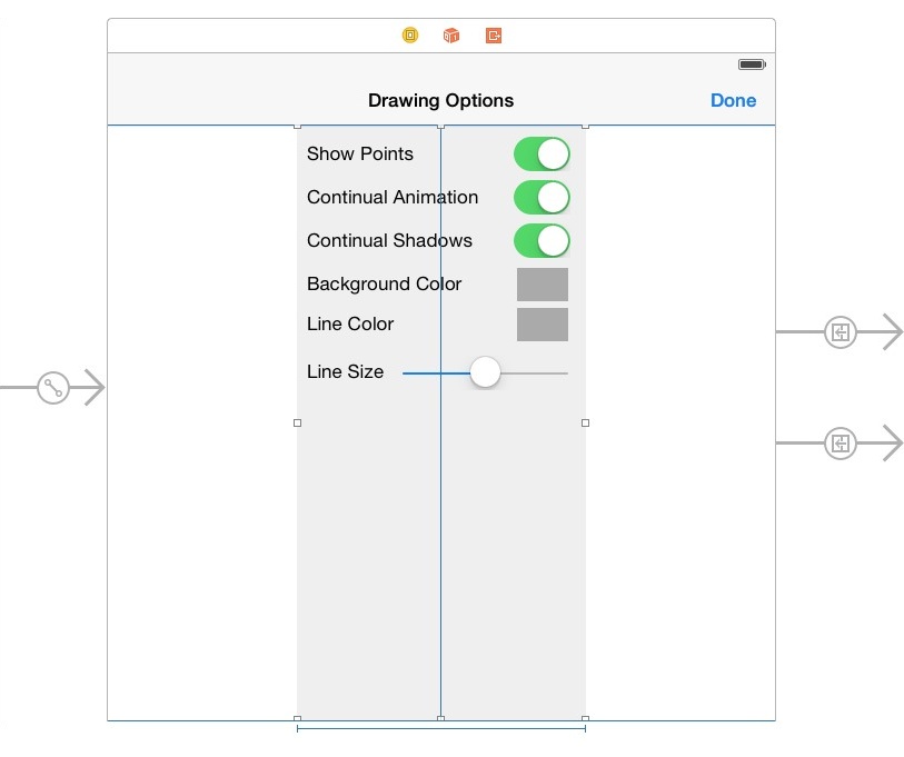
The result was that the UI elements were centered horizontally for the iPhone, and pegged to the top of the view’s nav bar. On the iPad, the Form Sheet is centered in the presenting view, and the sheet itself is exactly the size I specified for a minimal bounding rectangle.
In the end, I was able to accomplish my goals of porting Jack Friggard’s code to Objective-C and Cocoa Touch, getting a little more familiar with Storyboards, and creating a universal interface without any device-dependent code or xib files.
But that last goal really only was reasonable in the first place because of the simple main view, toolbar, and option UI views — a more typical app is likely to have UI elements that either must, or should, be more device-specific. Xcode’s automatic layout and constraint features allow for the possibility of sharing more UI than has been possible in earlier versions, but a well-designed interface should very much take into account the dimensions of the device. With storyboard-based apps, this may mean multiple storyboards; however, Xcode 6 supports Size Classes for constructing universal app interfaces (see this thread as well).